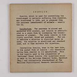
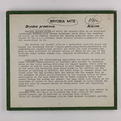
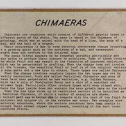
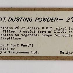
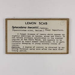
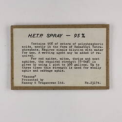
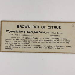
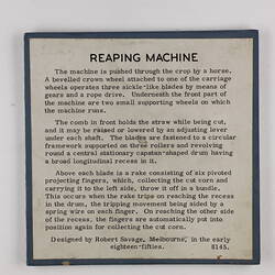
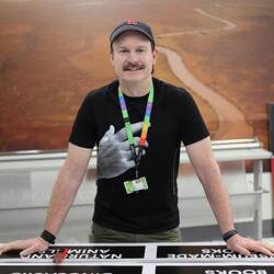
To understand these changes I spoke to Museums Victoria's outgoing Graphic Display Officer Trevor Mason and Exhibition Designer Richard Glover, who have held roles at Museums Victoria for over 20 years.
Richard Glover joined Museums Victoria when it was still located on Russell Street in 1990. Richard had already been designing exhibition labels for the National Gallery of Victoria for almost a decade. Trevor Mason joined Museums Victoria as it moved to its new campus at Carlton Gardens in 2000. After two years as a customer service officer, he took up the role of Graphic Display Officer and has overseen the graphic print collateral of the whole of Museums Victoria since then.
I invited them both to join us to view some of the historic labels in the collection store and asked them about the process now.
How many labels do you think you print for an Exhibition?
Trevor observed that his role has evolved as Museums worldwide see more digital interpretation within exhibitions and collections, and immersive experiences have meant less printing and an increase in lit labels and projections. "Over the last year, although very busy with other print projects within the Museum, printing output for exhibitions is low because of the swing towards digital interpretation. This is an interesting thing in how the organisation is going because it was very object rich when I began. So, you have the Melbourne Story exhibition, for example, where a considerable number of objects are on display, that is no longer the case now. So, the production of labels from hundreds in that case has gone down to maybe, anywhere up to 20 to 50 for a temporary show."
What are some significant changes you have seen?
Trevor notes "When Melbourne Museum moved to Carlton Gardens around 2000, there was a big transition to predominantly in-house printing. To do this, the Museum had to acquire new equipment whereas before that, we used old photography skills."
Richard Glover, who began at the Museum in 1990 when the collection was housed in Rusell Street, adds, "I was at the NGV in the 80s, and I used to make the labels and cut them out. We used a repro camera, printed on bromide prints, and then mounted them to board and cut them out. Then, when I moved here in the 90s, we advanced to getting type settings done, sending them out, getting the type, nailing them onto the board ourselves, and hand cutting them out. It used to be a huge process. These days, the in-house design team will just hand over a PDF file for us to print. So they control everything regarding the look, size, scale and font. All the design these days is determined by in-house design and style guides."
What changes have you noticed stylistically?
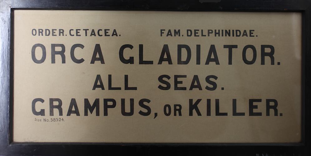
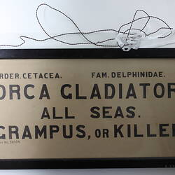
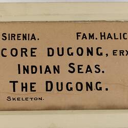
Pointing to a large, hand-painted wooden, double-sided sign for the Orca Gladiator from the late 1800's Trevor declared "see, this is a good example of less is more - just an object and then a brief description. You can see that there was little input from a design perspective. It was more a curator or scientist putting together what they wanted, and that is why the labels from this time varied from a few words, like a handwritten scientific name, to a whole paragraph of information typed out - curators gone mad! The words on labels were 'all over the shop', whereas now that has been refined and more tightly controlled with the design and the layout of how we produce labels in the past twenty or so years."
Richard recalls "Depending on who was running the department, there were times when the design style was immovable, then when staff changed, the styles just changed!"
Rebecca Carland, the senior curator for the history of collections at Museums Victoria, adds that in more recent Museum practice, the look and feel of the exhibitions is governed by strict style guides, accessibility and readability.
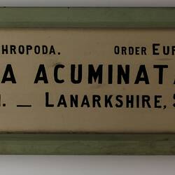
As we look closely at the earliest, handwritten labels, we can see the writer's hand in the warped letters where the use of a ruler to keep a straight line under the letters can be seen. Carland, who has a deep knowledge of the history of Museums Victoria, says that Arthur Bartholomew, an illustrator and attendant to Director Frederick McCoy in this early period, is a candidate for the handwriting on many of these early labels. His illustrations of zoological and geological specimens are held in the collection, and he was known to write all the labels for McCoy's system garden. "It is such a marker of how working life at the museum has changed. It would take time and care to do this handwriting. It just shows where we are at as an organisation now, where it is go, go, go."
Trevor says "These days, while we can replicate easily, and anyone could print a label because of the technology involved, they do not have that personal touch, a story, the writer's hand. There would have been a real art to what they were doing because there was that time to spend. That leap to a digital process instead of having to do that labour-intensive hand lettering has been a giant step forward because it has facilitated speed and, especially from a design perspective, the ability to correct errors. After all, you can jump on a computer screen and click; it is an easy fix. In contrast, the older methods were literally back to the drawing board to start again."
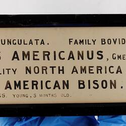
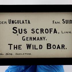
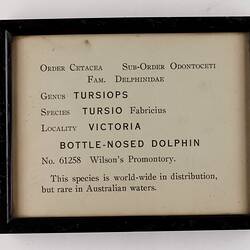
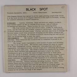
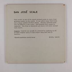
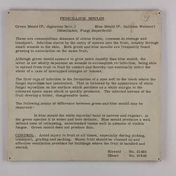
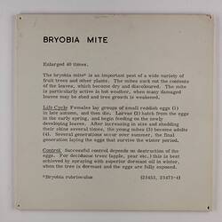
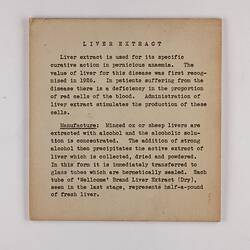
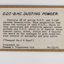
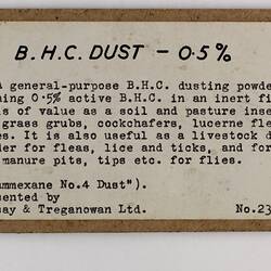
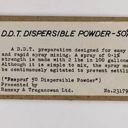
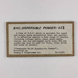
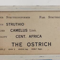
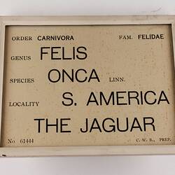
We look more closely at a group of labels which came to the curator with a handwritten post-it note saying "1992 Whale exhibition". Richard mentions "These are before my time and date back to the 1980s before our move to Carlton Gardens. They could even be into the 1990s, and this kind of labelling was common across all Melbourne institutions. Black printing on a white background on a foam mount is still a standard font used today." Trevor adds "what is interesting here is that we must now consider durability with mounts. In the past, Museums were very object-focused, now, Museums are visitor-centric and audience satisfaction-focused, and many galleries are interactive and immersive. This means Museum labels need to be very durable.
"Labels get wrecked all the time, not just toddlers but adults; people love to touch labels!" Trevor says. "Audiences and museumgoers like to touch everything more these days compared to decades past. Many more children are coming through and I think parents and Museum staff were stricter in the galleries in the past. Now, we need to make everything child-oriented, durable and safe."
What do you think is your favourite label here?
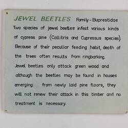
"This... It is the colour and the type. That would not be out of place like a trendy, hipster coffee shop place now. It is just a gorgeous colour that people are painting their kitchens and their houses. There is something about the combination of that green and the hand [writing]. Gorgeous lettering, what they used to call ticket writing because my dad studied it once upon a time. He was very good with his hands."
Richard declares his favourite is the "Orca Gladiator" because it is "beautifully handwritten, and you can see where the Indian ink, you know, the sort of shellac-based inks at the time, see how it has bled a little around the edges. It is a beauty."
And as we wrap up the session Trevor reflects on the meticulous work and detail of his predecessors. "Imagine if that was our job now. Handwriting signage!"
It is clear from this conversation that the Historic Labels Collection documents significant shifts in the use of materials, fonts, styles, and aesthetics, and the introduction of modern technologies and both Trevor and Richard agree it is a valuable addition to the history of museum exhibition practice.
More Information
-
Keywords
-
Authors
-
Article types

![Exhibition Label - Klipspringer [damaged], National Museum of Victoria, Parkville, circa 1880](/content/media/15/1629415-thumbnail.jpg)
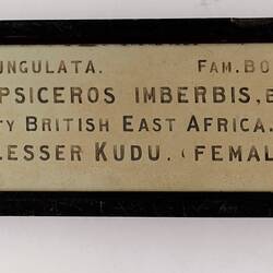
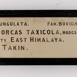
![Exhibition Label - Lesser Kudu (male) [damaged], National Museum of Victoria, Parkville, circa 1880](/content/media/27/1629427-thumbnail.jpg)
